

Tori
A Woman Who Knows Herself
The Story Behind the Artwork
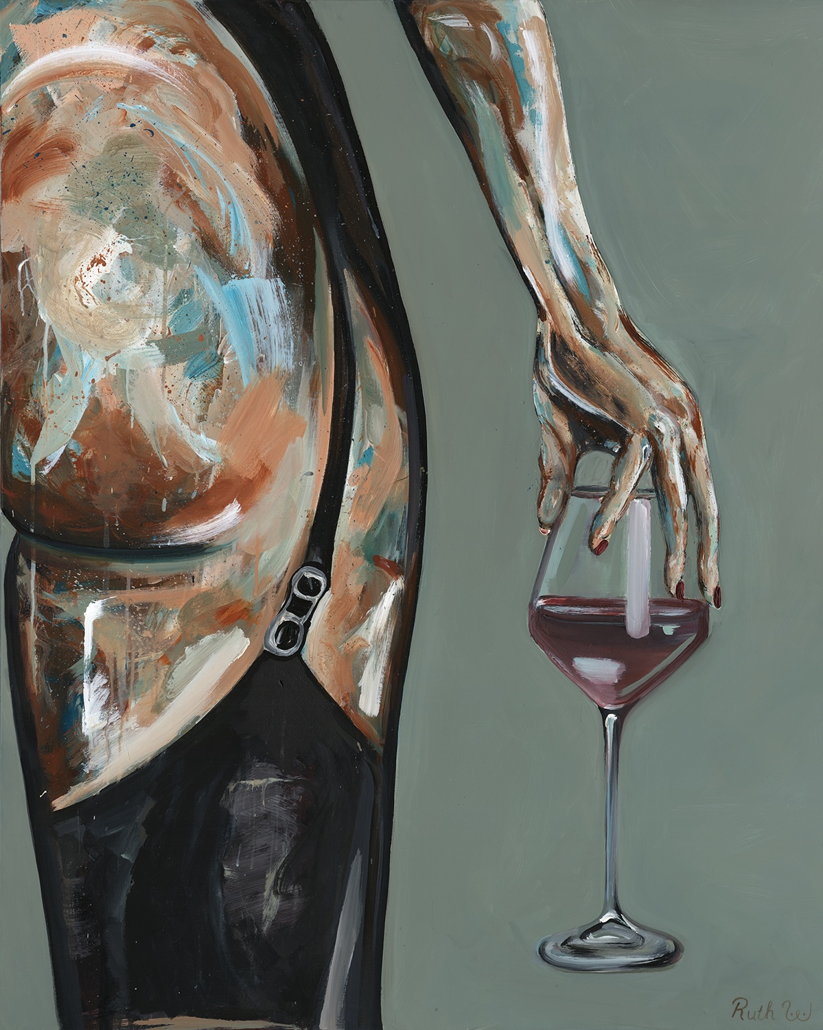
Tori. She knows who she is, and you understand immediately. She isn’t performing, posing or waiting for permission to exist. The moment her curves appeared on the canvas, the piece took on its own emotional weight. It became about that powerful moment a woman stands in her body with complete self assurance, grounded in confidence.
Visual elements
The fact the image is cropped represents a woman's boundaries - the viewer is invited into proximity but not given full access. This selective framing created a sense of intimacy that belongs to the woman herself rather than to anyone observing her. The pose conveys unhurried confidence. Her hand is relaxed, her presence unforced. The lingerie deepens this intimacy, not as an act of seduction but framing femininity as self owned not performed. The red wine becomes a visual and emotional anchor. Its colour carries warmth and depth. It is a small but powerful cue that shifts the mood towards introspection and grounded sensuality.
Meaning and intent
At its core, Tori examines the difference between sensuality and sexualisation. The figure is undeniably sensual, yet she is not positioned for external approval. Her body language expresses a depiction of femininity that exists outside the demands of the male gaze. The artwork speaks to a growing desire among women to see themselves represented in a way that is sensual without being objectified, intimate without being exposed. Ultimately, Tori celebrates the quiet authority a woman holds when she is entirely her own. The emotional clarity that appears in the confidence that comes from inhabiting one's body without apology and the right to be seen on one's own terms.