

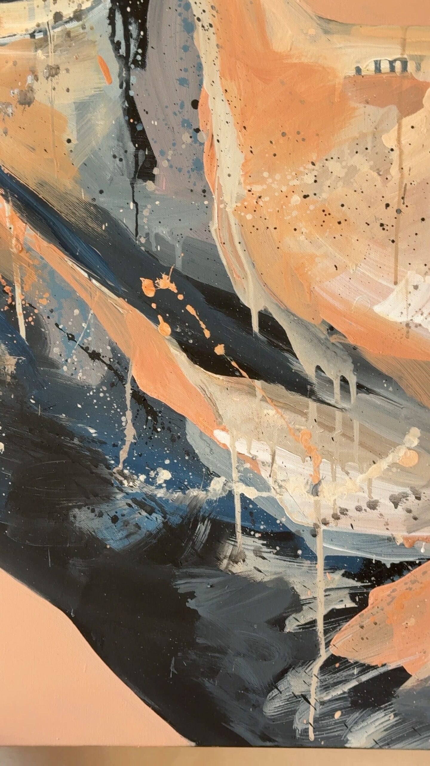
The Grey Area
The Story Behind the Artwork
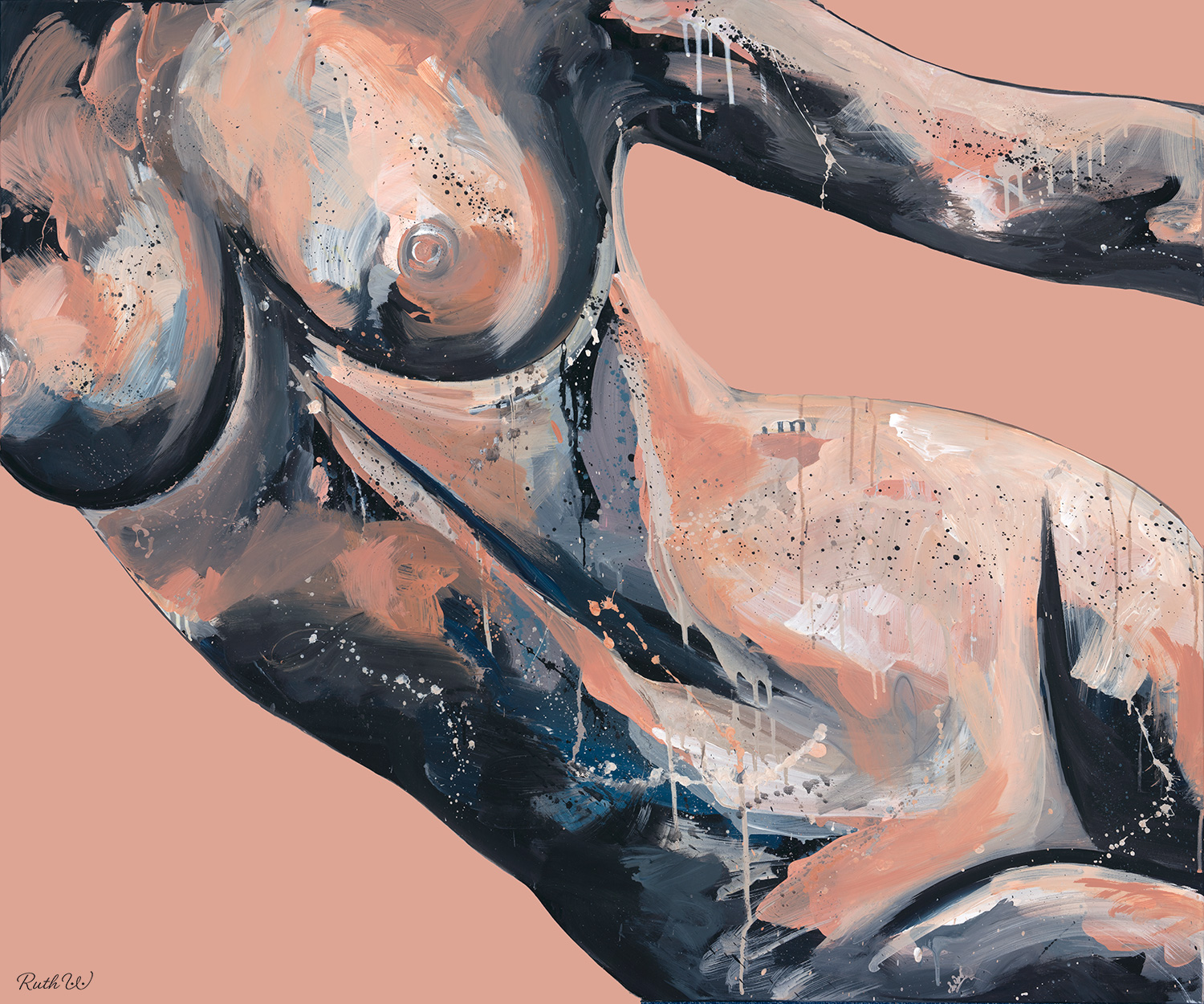
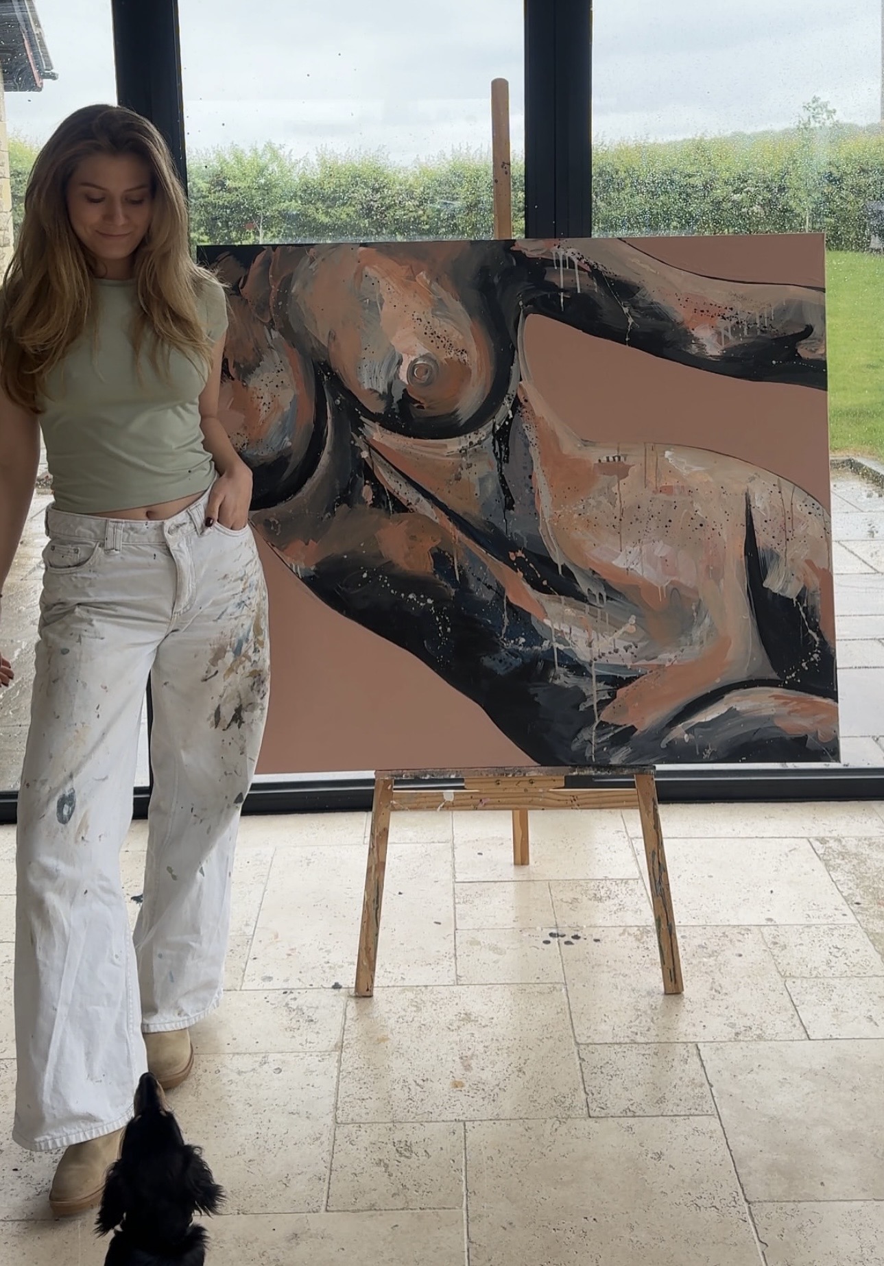
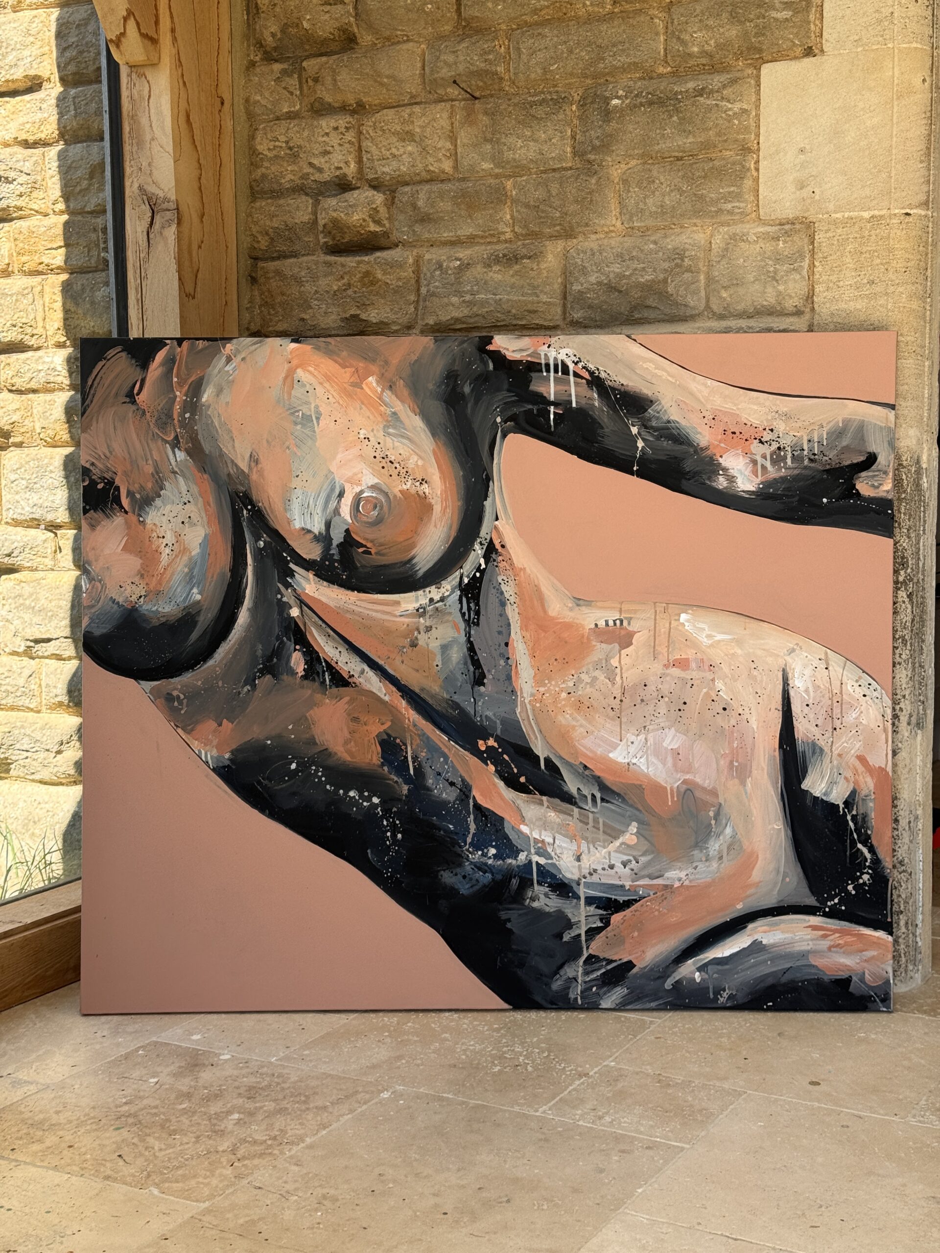
The Grey Area explores experiences that can be difficult to define, explain or fully comprehend. The title refers to the emotional ambiguity that can surround conversations about consent and boundaries.
For many women, discomfort does not always come from obvious acts of violence, but from pressure, persistence, expectation, guilt or situations where saying no never felt like a genuine option. These experiences can leave a lasting emotional imprint long after they have passed.
Rather than the painting displaying shock or confrontation, it offers a reflection on those moments and the uncertainty they can leave behind.
Visual elements
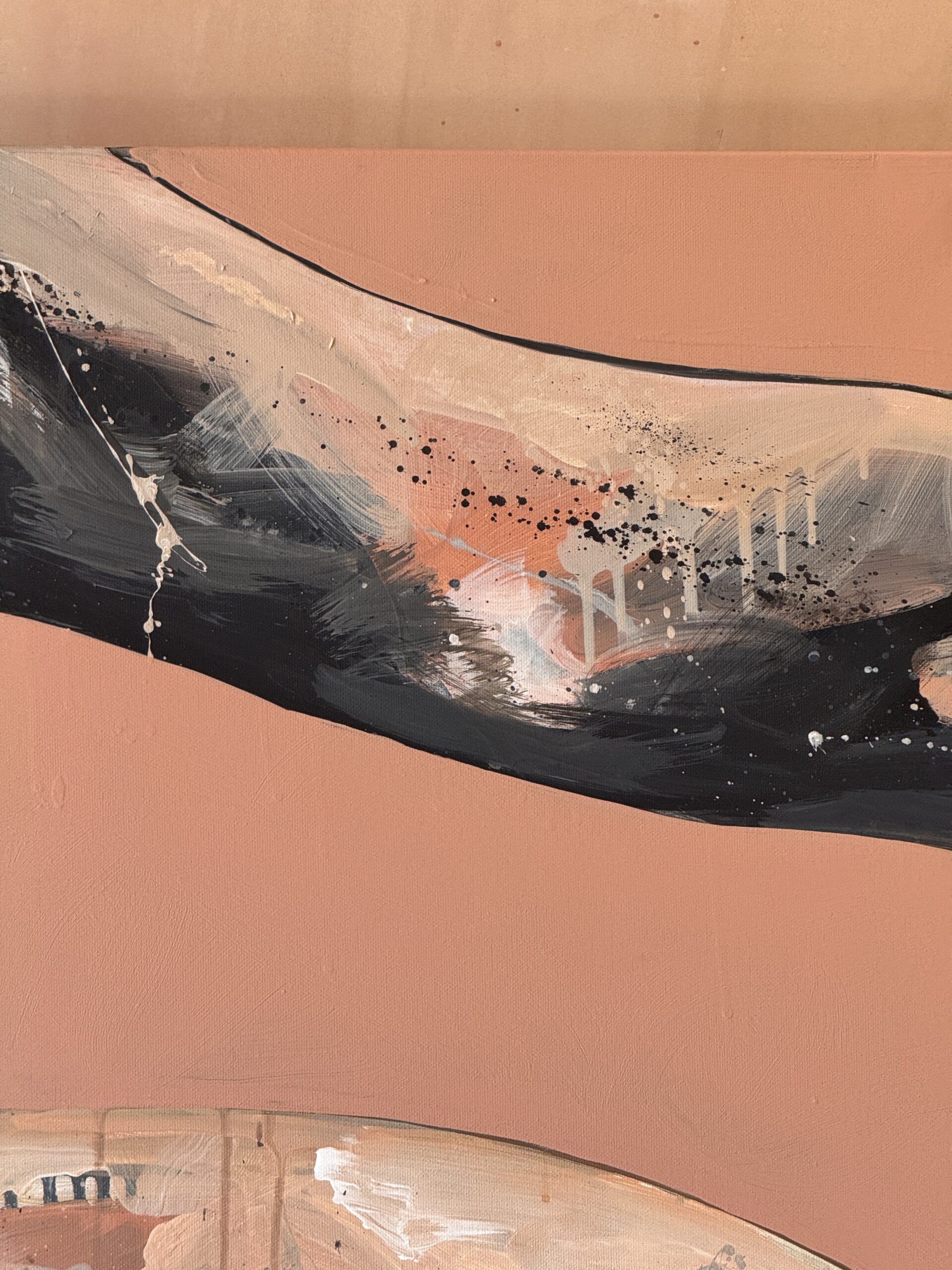
The colours are doing a lot of the emotional work in this painting. The dusty pink is associated with softness and romance, it is muted like clay and desaturated so it feels like plaster. Pink represents the desire to move through life with optimism towards new relationships. The grey interprets that. Grey is a colour of ambiguity that refuses extremes. The space where experiences, intentions and emotions are not always easily defined as good or bad. Together the colours mirror the tension between wanting to trust, connect and embrace romance, while carrying the uncertainty that can arise when personal feelings become difficult to untangle.